props to box plots

How did Fabian over at Information & Visualization know I was a sucker for effusive praise? Fabian compliments my adoption of the Tufte box plot, combination with histogram, and what I might call a temporal box plot display with superimposed line graph (I’ll need a better name than that) in my World Freedom Atlas.

box plots from the World Freedom Atlas

Still, Fabian offers some reasoned criticism of the Tufteist approach to box plots:

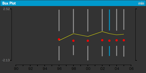
Tufte’s recommendation is based on the notion of avoiding chart junk and the principle of maximizing data ink, i.e. the ink in the drawing should be used to display data and not decoration or junk. While this is certainly a good guideline, it is sometimes difficult to read. In the example of the world freedom atlas, it is only possible to decipher the actual values by looking at the box plot to the left. By maximizing the data ink sometimes the readability is minimized.

Fair enough, I think, though I would argue that the minimalist box plot is necessary in the box plot sequence (otherwise the display would be needlessly cluttered).

All this reminded me of a small assignment in Geography 572: Graphic Design in Cartography last semester. Having read some Tufte, especially his box plot redesign, we were to come up with a few of our own, presumably ones that drew from the Tufte philosophy, but perhaps exceeded his redesign in some way. Below are my efforts.

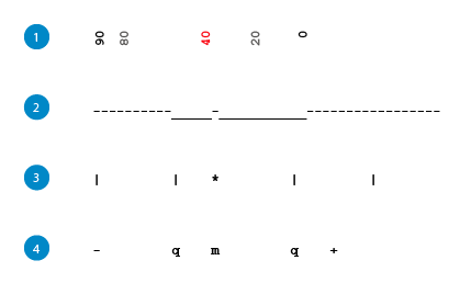
My theme was text, and I wanted box plots that could be quickly produced with standard characters. I don’t think any would satisfy the criticism above (nor come close to Tufte’s original minimalism), though the first is helpful in that the actual numbers are used as symbols.

mine is more like poorling

Part 2 of what will now be an ongoing series about my work with the Dorling circular cartogram algorithm; see part 1

the results of Dorling's original circular cartogram algorithm

Above (top) you see the current results of my reworking of the brilliant circular cartogram algorithm by Dr. Daniel Dorling (image on the bottom is from my Python port of Dr. Dorling’s original algorithm, using his original input format). So far it’s looking pretty poor; but you should have seen it a week ago.

Now, there’s nothing wrong with the algorithm created by Dr. Dorling, as published as C code in Area Cartograms (1996) or as Pascal code in a 1995 article in Environment and Planning. But the algorithm requires as input something that doesn’t really exist for most geographies — that is, something that needs to be generated. Specifically, the algorithm requires a text file of the following format:


Feature_number Value(any variable) x-center y-center number_of_neighbors [neighbor_number common_boundary_length]…(repeated)

Apparently, in the 1980s, Arc used a topological data model (.aat files), which made generating the above file easier (though Prof. Dorling suggests that some manual changes were still necessary). The currently popular, Arc standard, shapefile is a non-topological data model, meaning that each feature (a country, say) is stored independently of all others — shared borders are in no way encoded. Detecting them would be very computationally intensive, and would likely require some type of spatial hashing, even using a language such as C++. But it has been done (see mapshaper.org).

So I was willing to begin writing a script to detect and store the length of shared borders, using only a shapefile as its input. But then a much simpler method occurred to me. You see, shared border length is just one way of representing topology and of determining what neighbors an individual feature has. Another way, seemingly, was to simply use inverse distance between centroids. Centroids could be calculated for each feature, and if two centroids are within a certain threshold, the features could be considered neighbors.

Though the code and pseudo-code for the algorithm are published in Area Cartograms, it really hinges on two forces: repulsion and attraction between bodies. Repulsion is based simply on overlap of circles. Attraction was initially based on shared border length, but seemingly could be modified to work with inverse distance between centroids.

As is obvious from the images above, the modification was not perfect — inverse distance could not simply stand in for shared border length. But I have many ideas for fixing this, and will get into these in a future post. And fantastically, Dr. Jim Burt has agreed to supervise an independent study on this, so that I can actually gain school credit for my obsession. More soon!

kelso’s corner

While surfing one of the internets yesterday, I stumbled onto Kelso’s Corner, the very cool blog of Washington Post cartographer Nathaniel Vaughn Kelso. And since he’s already broken the news there, I thought I may as well mention it here as well.

Last November, I applied to the Washington Post Summer Internship Program thinking it a shot in the dark. I was recently delighted to find out that I’d made the cut.

So this summer I’ll be moving to the District (after hopefully finishing my thesis here in Madison…) to join the Post’s News Art Department. I’ll be working on a lot of static maps, but also hopefully using my skills in programming/interaction design/information visualization in their dot com department. I’m not looking at all past the summer — it’s exciting enough to get to spend a few months at the Post, especially just a few months before the big election.

So check out my future boss colleague’s blog. There he posts a ton on news graphics and information visualizations. And he seems to update frequently, unlike….

dorling.py

Dr. Daniel Dorling was recently nice enough to provide me with some C sourcecode for producing his circular cartograms. And it works great! I’ve already ported it to Python and have consumed the result in Flash. Below is a screenshot of a circular cartogram of British population by county. That’s after 300 iterations of the algorithm, which took about 2 seconds.

dorling screenshot

Next step: getting the program to consume shapefiles/DBFs rather than its current proprietary format. This will work its way into something. Stay tuned!

shapefiles / projections in Flash / AS3

Below is linked a little teaser from my recent experimentation with loading shapefiles.

projections screenshot

indiemaps.com/shapefile

In the above, the work of loading the shapefiles is mostly done by the Vanrijkom classes I spoke of earlier. When I wrote before, I was more interested in loading shapefiles with PHP, and using Flash Remoting to pass in the shapefile information. It turns out, though, that the AS classes are lightning fast, and applying point transformations is decently swift.

I’ve rewritten some of Vanrijkom’s code, and have written a few new classes to manage the loading, projecting, and drawing of shapefiles. It would take only a few more methods to load in a DBF file with attributes, and apply the symbology (choropleth, dot density, isoline, proportional symbol) to the features. Currently, I can load and draw the three main shapefile types: point, polyline, and polygon.

I’m still confident that the remoting route, whether with AMFPHP and PHP or XML and Python or C, will be the way to go. Especially when I want to add in cartograms. But, for now, it’s nice to know that a lot of this can be handled natively in Flash.