SpatialKey: insanely good geovisualization

I’m a little late on this, so I hope it’s old news to most readers that Universal Mind, where I’ve worked for the past 2 months, just launched a technology preview of the SpatialKey visualization system.  This is a big deal.

Andrew Powell, Doug McCune, and Brandon Purcell have already posted great introductions to SpatialKey, so I won’t go through all that here. But just so’s you know: SpatialKey is a visualization system for geotemporal (location + time) data, developed primarily in Flex, that lets you filter and render thousands of points very quickly, all client-side in your browser.

This is not a formal release. We’re in a technology preview for now, which means you just get to see some sweet examples, but soon we’ll release a version, SpatialKey Personal, into which you can load and visualize your own data. Here are links to three of my favorite examples (for more, check out our Gallery page, or this post on the SpatialKey blog).

As I said, other better introductions have been written on SpatialKey; I just want to focus on a few of my favorite features or attributes.

not a single, do-it-all application

SpatialKey is based around a collection of visualization templates. Each offers a unique view of the data, with specialized visualizations, filters, and UI controls. Since the templates are specialized, each one is pretty easy to learn and begin using.

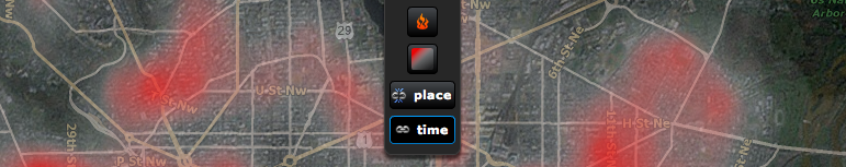
The examples linked above demonstrate the animation, map comparison, and drill down templates. The fourth template we’re showing off now is the temporal heat index template (here’s an example of that: Sacramento residential burglaries).

chorodot symbolization

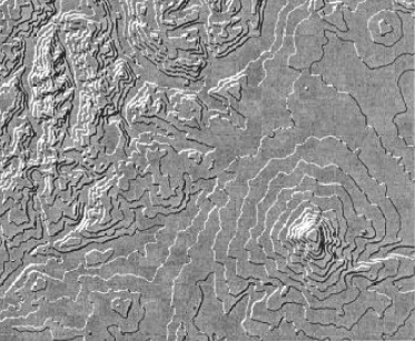
You don’t see these much, but I think they’re really effective. The “heat grid” symbolization in SpatialKey is a modern implementation of a technique put forth by Alan MacEachren and David DiBiase in 1991.

Aggregating points to arbitrary but regularly-shaped polygons, or binning, was an extant graphical practice at the time, but the geographic application and their particular methods created an effective cartographic symbology. Other than SpatialKey, I haven’t seen this symbolization in a geographic visualization context, but I think it’s very effective at presenting large datasets that require aggregation. The heat grid symbolization in SpatialKey extends the approach by allowing grid renderings of attributes of the data (like house prices or temperature) in addition to aggregation of the count of points.

chorodot of AIDS cases in Pennsylvania

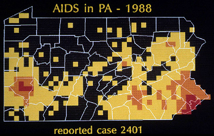
MacEachran and DiBiase’s example chorodot map of AIDS in Pennsylvania (image from J.B. Krygier’s lecture notes)

grid symbology in SpatialKey, implementation of the chorodot cartographic symbology

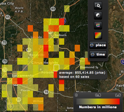
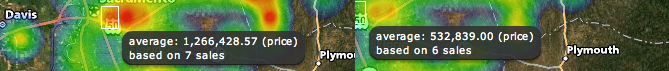
SpatialKey grid symbolization showing a data attribute (average home prices) in Sacramento county

small multiples / map comparison

I’ve always been a fan of the small multiples depiction of change, illustrated so well by Edward Tufte in The Visual Display of Quantitative Information and Envisioning Information. Though the SpatialKey Map Comparison template shows two multiples, it qualifies (and we can easily plug in more maps for specialized templates).

D.C. construction in the SpatialKey Map Comparison template

Both the maps and the time charts are live-linked. Mousing over an area on one of the maps or a bar on one of the time charts reveals the tooltip for both displays, allowing you to easily retrieve specifics for different time periods or areas.

complex temporal filtering and focusing via the heat index chart

The time chart, shown in the first screenshot above, is great for revealing linear temporal trends in a dataset, and for enabling linear filtering. But some datasets evince more complex temporal trends — for example, some crimes may be more common on a certain day of the week and at a certain time of day. Such trends are lost when data is aggregated in a linear fashion to, say, days or weeks.

sex crime arrests in Sacramento

The temporal heat index chart reveals such complex trends and allows filtering by multiple temporal aspects simultaneously (for example, showing only prostitution arrests on Tuesdays between 3 and 4 am).

in closing

I was late to the game on this one, joining Universal Mind in June. SpatialKey was developed by the brilliant team of Doug McCune, Ben Stucki, and Andrew Powell, led by Brandon Purcell and Tom Link, with product manager Mike Connor. It’s a privilege working with such a talented crew.

Our goals for this technology preview are modest (blowing minds, getting feedback), but we’re excited to continue developing SpatialKey and SpatialKey Law Enforcement. And we’ll be releasing updates, new examples, and SpatialKey Personal in the near future. So stay tuned to the SpatialKey blog, and please contact us if you have any feedback on our technology preview.

seeing the plate

I’m really digging the Boston Globe’s recent visualization tracking Manny Ramirez’s hunt for 500 home runs (reached on May 31st).

This cool app answers seemingly every question about when and how Manny hit his home runs…except for the one I’m most interested in: where on the plate is Manny most likely to hit a home run? I’ve seen a few visualizations recently that do this sort of thing, so I thought I’d share this view of current practices in the area of pitch location v. batting performance visualization.

ESPN will often show you a 1D view (showing only the x dimension of the pitch location) during games, dividing the plate into three horizontal segments (in this case showing the number of home runs this year by Vladimir Guerrero):

A more advanced, 2D view of the same is used often on ESPN’s Baseball Tonight:

For a while now, ESPN.com’s baseball Gamecasts have shown real-time pitch locations, including whether the ball was called a strike (red) or a ball (green).

Turning on “Hit Zones” reveals a very cool diverging blue-to-red heatchart-style graphic of batting performance in the 9 segments of the plate’s plane.

The above is apparently a common method of showing this statistic. These heatcharts differ in 1) how many segments the plate is divided into and 2) whether a sequential or diverging color scheme is used. Here’s one — with many more segments and a high swing zone — for Ted Williams, from the Official Ted Williams Website.

And a very cool report in the Baseball Analysts shows batting averages with 20 pitch location squares, aggregated over two seasons, and divided into the four types of batter-pitcher matchups. For example, the image below shows the greyscale heatchart for the matchup, Left-handed pitcher vs. Left-handed batter.

MLB.com’s Gameday does a better job, methinks, of showing pitch locations relative to the batter and the plate. But they don’t give any indication of the particular batter’s performance with different pitch locations:

I also like the above because it at least suggests the 3d nature of the strike zone: pitches with movement will not leave the space above the plate at the same position as they entered it. The heatcharts shown above do a good job of showing pitch locations in the x and z dimensions. A pitch visualization notable for showing these x and z locations at various points in y space is Lokesh Dhakar’s Baseball Pitches Illustrated (shown below is the slider), though this too is concerned only with pitching.

Thanks to the PITCHf/x system, there is a ton of pitch location data available. Currently, though, there have been few attempts to flexibly visualize this data. One app, the PITCHf/x tool by Josh Kalk, is quite flexible, but the charts themselves leave something to be desired (below for Ben Sheets).

I’m thinking more of a tool like Visual i|o’s baseball visualization tool, or the Boston Globe app linked above, that would take advantage of this rich data, but allow it to be manipulated and filtered in real-time. For example, I’d love to just look at called strikes or balls, and be able to filter that down by ballpark, or perhaps even by individual umpire, and visualize it by the ratio of strikes-to-balls, to get a better idea of the true strike zone. And, it’s worth noting that there’s no reason this information need be aggregated to grid squares; it could also be shown with a continuous density representation like this style of heatmap.

isolining package for ActionScript 3

A week or so back I wrote about a package I ported/modified to create the Delaunay triangulation in Flash with a few AS3 classes. As I noted there, such a triangulated irregular network (TIN) allows us to interpolate isolines — lines of constant value (aka isarithms, commonly called contours).

So, given a field of points (weather stations, say)…

weather stations

…with one or more attributes attached (temperature, say)…

weather stations for interpolation

…a TIN can be constructed.

triangulated irregular network

With the above TIN, values can be interpolated along each edge between the points of known values (control points). The interpolation is strictly linear (that is, the value 50 would be interpolated halfway along an edge whose control points were valued 48 and 52).

interpolated points for isolining

With a given contouring interval (I’m using 4 degrees F here), we can connect some of these interpolated points, creating our contour lines.

rigid isolines, ready for smoothing

With the previous steps stripped away, this creates a passable isoline map.

masked isolines

The lines are rigid, though, and should be smoothed for presentation. I allow two methods for this. You can use the “simple” method, which just uses the built-in graphics method curveTo between the midpoint of each isoline segment (below with the isoline interval decreased to 3 degrees).

simple curves for isolining

The above looks alright, but the curves are not continuous, closed loops can still have hard corners, and the isolines no longer pass through the interpolated points (we have therefore generalized an already-inaccurate interpolation). My compatriot Andy Woodruff, author of the glorious new Cartogrammar blog, offered to write a nice continuous curve method that ensured isolines would still pass through the interpolated values. You can read about the method in his post. Here she blows:

continuous curves for isolining

Bringing it all together, then, and incorporating the only extra feature I wrote (tinting of isolines), here’s a nice finished isoline map of temperature across the U.S.

finished isoline map of U.S. temperature

My new isolining package for Flash/ActionScript3 accomplishes all of the above, requiring only an array of point data with attribute values attached. The above example, was accomplished with the following lines of code (after drawing the U.S. states from a shapefile).

//first, generate the array of triangles (ITriangle objects) from the point data
var triangles:Array = Delaunay.triangulate(points);
Delaunay.drawDelaunay(triangles, points, triClip, false); //comment this out if you don't want to draw the triangulation
//generate an array of isolines (isoline objects)
var isos:Array = IsoUtils.isoline(triangles, points, triClip, 3, 0);
//create color and class arrays for tinting the isolines
var classesArray:Array = new Array(40, 44, 48, 52, 56, 60, 64, 68, 72, 76);
var colorsArray:Array = new Array(0x051CFD, 0x4602FD, 0x6D0EEB, 0x8400FF, 0xC400FF, 0xEA00FF, 0xFF00E2, 0xFF0095, 0xFF0030, 0xFF0015, 0xFB3507);
//then, actually draw them, using a continuous curve
IsoUtils.drawIsolines(isos, triClip, "continuous", colorsArray, classesArray, .5, .95);

The full example is included in the .zip distribution. Get that here:

Keep in mind: triangulation is just one interpolation method, and is many ways the least technical (and accurate). More accurate interpolation techniques include inverse-distance and kriging. ***If you’re having trouble, and your isoline interval is not an integer, check out the comment at line 171 of isoUtils.as. Please fix that, BTW.

I meant to add other features, but since I started work this past week, I’m posting the package as-is, and invite others to modify. On my wishlist:

  • hypsometric tinting, or color between the lines, would allow for more effective terrain or temperature mapping
  • support for projections and other coordinate conversions in the drawIsolines method. I have packages for converting lat/long to a number of map projections, but currently the drawIsolines method doesn’t have support for passing a point coordinate conversion method.
  • an animated demo. This thing’s lightning-fast, so why not?
  • something that would be super wicked would be if someone would implement Tanaka’s illuminated contours [pdf] method, that thickens/thins and darkens/lightens lines like so…
    tanaka method
    …creating beautiful relief maps like the one below
    tanaka illuminated contours

If you add anything to the package, feel free to post a link to your revised version in the comments.