notes on noncontiguous cartograms and ActionScript 3 classes for producing them
Fully contiguous cartograms have stretched and distorted borders but perfectly maintained topologies. Like the Gastner-Newman diffusion-based cartograms we see all over the place. Though all sorts of cartogram designs have been produced, those with perfect topology preservation (fully contiguous cartograms) receive the majority of academic and popular press attention.
Some notable exceptions are the well done animated ones by Mapping Worlds and a recent NY Times example showing electors per voter that I’ll return to later. These fully noncontiguous cartograms preserve the shapes of enumeration units perfectly, but don’t even attempt to preserve any borders or adjacencies from the original map.
Judy Olson (Wisconsin Geography alum natch) wrote the only academic article to focus specifically on this cartogram symbology in 1976. She believed noncontiguous cartograms held three potential advantages over contiguous cartograms (I’ve three more below):
- “the empty areas, or gaps, between observation units are meaningful representations of discrepancies of values, these discrepancies generally being a major reason for constructing a cartogram”
- production of noncontiguous cartograms involves “only the discrete units for which information is available and only the lines which can be accurately relocated on the original map appear on the noncontiguous cartogram”
- because of perfect shape preservation, “recognition of the units represented is relatively uncomplicated for the reader”
Despite these inherent advantages (along with ease of production), all the early value-by-area cartograms I’ve seen maintain contiguity. Some took the radical step of abstracting features to geometric primitives, like Levasseur’s early French examples (which may not have been cartograms) and Erwin Raisz’s early American “rectangular statistical cartograms”. But in many ways the noncontiguous design is the more radical cartogram, as it actually breaks the basemap apart — rather than skewing shared borders it abandons them.
my AS3 classes
Olson outlines a technique — the projector method — for manually producing such cartograms. A projector capable of precise numeric reduction/enlargement was required, but not much else, and accurate cartograms could be produced in minutes. A scaling factor was calculated for each enumeration unit, the projector was set to this value, and the projected borders were traced, keeping units centered on their original centers.
My AS3 NoncontiguousCartogram class works similarly. It takes an array of objects containing geometry and attribute properties and creates a noncontiguous cartogram. I include methods for creating the input array from a shapefile/dbf combo, but using KML, WKT, or geoJSON representations wouldn’t be too hard. Methods are included for projecting this lat/long linework (to Lambert’s Conformal Conic projection at least). The NoncontiguousCartogram class draws the input geography, figures the area of each feature, and scales figures according to their density in the chosen thematic variable.
It’s all good/in ActionScript 3, so can be used in Flash or Flex. The zip distribution includes the following:
- the main NoncontiguousCartogram.as class
- two example applications and the data needed to run them
- utility classes, including some that make creating cartograms from shp/dbf input quite easy
- Edwin Van Rijkom’s SHP and DBF libraries, which are used to load the shapefiles in both of the included examples
- Keith Peters’ MinimalComps AS3 component library, for the components used in one of the examples
- Grant Skinner’s gTween class, which is required by the NoncontiguousCartogram class for tween transitions
Browse all the above or download the zip.
Flash examples
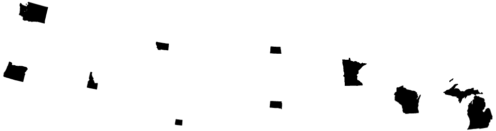
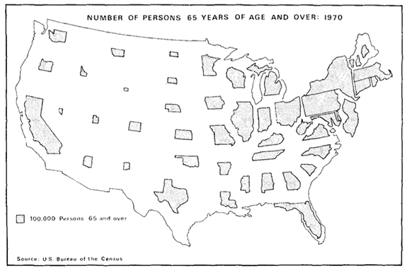
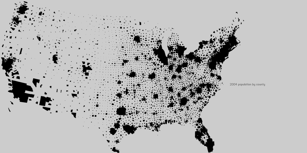
I created a few examples, all started from just shapefile input. The following are screenshots, but there are interactive examples further down. First, an example out of Olson’s article, presumably produced using the “projector method” described above:
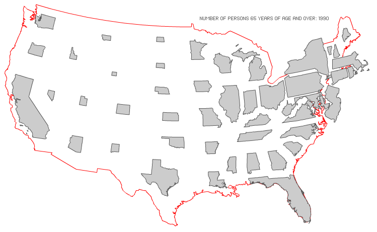
Here I’ve updated Olson’s example with more recent data and a snazzy red outline:
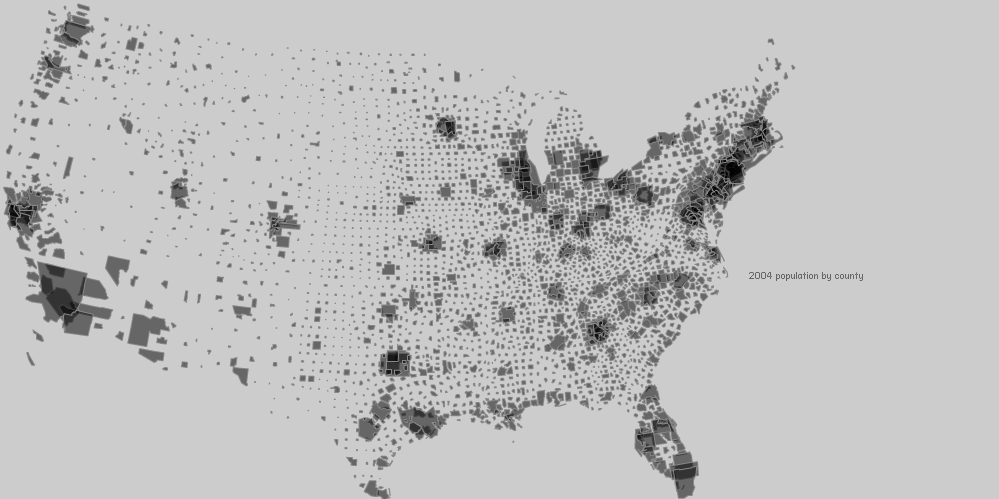
This one took a few secs to load the shapefile, project to Winkel Tripel, draw, and scale the cartogram by population:
The above is great as an artistic rendering, but is probably a bad depiction of the data as 10% of the counties have increased in size and there is a fair bit of overlap. Decreasing the alpha of the counties reveals the overlap, and creates a really interesting rendering of the data.
If you’ve read this far, you probably at least want to see some shit move around or something. Here’s an example I put together with election data; it shows off the basic updating and tweening capabilities built into the class. Notice how all features are drawn around their centroid and therefore remain centered as they change scale. Tweening is via Grant Skinner’s gTween and interface components are from Keith Peters’ MinimalComps library, which is great for prototyping in only AS3.
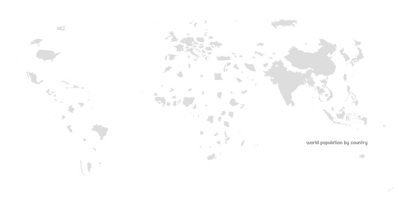
In the above, the “electors per voter” option is based on the same data as the well-made NY Times example I mentioned earlier, but something’s fishy about one of our scalings, because they don’t line up.
design considerations
Position and size. Both affect the one thing you’re trying to avoid on a noncontiguous cartogram: feature overlap. If features are left at their original centroids, overlap is likely if any units are enlarged. When sizing features on a noncontiguous cartogram, one feature is chosen as the “anchor unit”. This feature will stay the same size, and all others will be scaled up or down depending on whether their density is higher or lower than the anchor. If the unit with the highest density is chosen, overlap will be avoided because all other units will be reduced. This can often produce large areas of white space and units too small to recognize.
To address this, both the anchor unit and the feature centers are configurable. The “anchor percentile” is set in the class constructor, and can range from zero to one. If set to one, all but one feature will be reduced; if set to zero, all but one feature will be enlarged.
By default, features scale around their original centroids. You can pass a Dictionary of feature centers (using the objects contained in the combined array as keys) to the constructor (or via the settable property, featureCenters), which allows you to manually position the features. I include the following example to give you some ideas for how to use this feature. I create an interactive cartogram on which features can be moved around. Well Known Text representations of the feature centers are generated and converted into the required Dictionary via some included utility methods. Check out the source of this example to see what’s going on.
projections
In her 1976 article, Judy Olson used linework projected with an equal area projection. This was a requirement of her method, as she was using known land area measurements in her calculation of densities and scaling factors. My class calculates areas of features — projected or otherwise — before scaling, so any projection can be utilized and an accurately-scaled cartogram will result. In the examples above, I use a conformal projection (included in the source) on the points before passing to the cartogram class. Conformal projections preserve local angles (shape, sort of) and may result in features that are easier to recognize.
That said, for most applications it’s probably a good idea to use equivalent (equal area) projections before constructing these cartograms, as the divergence of the thematic variable from land area is often the point of creating the cartogram in the first place.
more advantages
In my thesis research last spring, noncontiguous cartograms performed quite well: subjects rated them highly on aesthetics and could locate and estimate the areas of features with relatively high accuracy. I would add the following to Olson’s list of noncontiguous cartogram advantages.
- Olson concentrates on the perfect shape preservation of noncontiguous cartograms. The form (well, those with units centered on the original enumeration unit centroids, as in Olson’s projector method) also perfectly preserves the location of the features on the resultant transformed cartogram. Not only are features easier to recognize, but locations within the transformed units can be accurately located as well (cities or mountain ranges from the original geography can be accurately plotted on the transformed cartogram).
- Because units are separate on the transformed cartogram, their figure-ground is increased and areas of features can therefore be more accurately estimated.
- Many cartogram designs (including most manual cartograms and the Gastner-Newman-produced cartograms) sacrifice some accuracy for shape recognition. This is a defensible tradeoff, especially as area estimation is notoriously inaccurate and nonlinear. Yet it’s a tradeoff that noncontigous cartograms need not make, as they can always perfectly represent the data with relative areas without sacrificing shape preservation.
Thus, noncontiguous cartograms seem to excel at the cartogram’s two main map-reading tasks: shape recognition and area estimation. This is mediated somewhat by the chief advantage of contiguous cartograms: compactness. Because no space is created between enumeration units, contiguous cartogram enumeration units can be larger than those on noncontiguous cartograms, all other things equal. The increased size on contiguous cartograms may improves their legibility.
15 Comments
Wow, that’s some really cool stuff you’ve written about there. I love the multitude of ways to display data, ways that find the balance between form and function especially appeal.
Nice Job
Interesting and thought-provoking points re: shape recognition and area estimation.
An idea popped into my head: wouldn’t it help sometimes to draw, in the background, in a lighter (more neutral) color, the original borders of the units? (Like Olson’s snazzy red outline of the U.S.; but applied to each state.)
Thus you could more easily see, for example, how much Wyoming had shrunk, as compared to Montana. Helpful for those states with lots of space between / around them. It would also help with shape recognition for units that have shrunk so small they’re hard to recognize. This capitalizes on one of the advantages of noncontiguous area cartograms over contiguous: the original borders don’t clash with the value-adjusted borders (unless you have overlap, in which case you have clashing anyway… and in those cases you may want to just have the ‘foreground’ data obscure the original borders).
I would also point out one disadvantage to the noncontiguous area cartogram (which you may have talked about — I skimmed some of the above). If there are blank areas on the map, such as the Great Lakes, that do *not* represent shrinkage due to discrepancies between values, they create noise that is difficult to separate from the actual data. Another example is oceans in the world map. Again, drawing the original map “in the background” — showing areas for which there is no value (oceans) in a different shade of gray than original density value areas (land) — could help with recognition and filtering out of noise.
Final observation… I was looking at your world population map, and thinking, while the shape recognition is definitely easier and the area estimation may be fine, it doesn’t have the same impact as the contiguous area cartogram (CAC?). I’m not saying that’s necessarily bad. But I’m trying to figure out what kind of difference it is.
It seems that the CAC communicates a feeling of distortion in a more emotional, even subtly moral dimension. Your quote from Olson mentions “discrepancies generally being a major reason for constructing a cartogram”. Discrepancies could be morally neutral, but often CAC’s carry a tone of wrongness via the bloated, swollen, fat country shapes shoving aside and distorting their emaciated, withered, skinny neighbors. (See those on http://www.worldmapper.org.) Thus CAC’s could be more effective for public policy (or propaganda) purposes, with NAC’s playing the role of more objective, academic communicators.
I’ll remember that next time I see a CAC…
Hi Zachary
I’m new to actionscript, mxml, and flex. I am trying to simply use your source to recreate the swf files, and can’t seem to do it. If there is any chance you have a few minutes to help me out, it would be much appreciated. I’ve been banging my head all around the web for about 10 hours now.
I have FLEX SDK 3, and have downloaded the noncontinous.zip file. Simply compiling either ManualCartogramTest.as or USStatesCartogramExample.as give swf files with no errors, but the swf movies show nothing in my browser. I’ve also tried to create a ManualCartogramTest instance in my own mxml file, without success.
I don’t have Flex Builder or any other Adobe software. What can I do to use your packages, or more importantly, the vanrijkom packages?
(I’m excited to come across your blog and portfolio. Interesting work! I’m working with continous cartograms and ArcGIS).
Jeff
hey
I had to use -use-network=false. That’s all. Woohoo.
super super super super cool. thanks for sharing all your source!
Thanks for finally writing about >indiemaps.
com/blog
I want to to thank you for this excellent read!
! I certainly enjoyed every bit of it. I’ve got you book marked to look at new things you post…
The ship will make a first quit in Freeport, Bahamas, where it will unload six motor yachts, one sport fishing boat and one sailboat. The company has been producing a large range of luxury yachts because the year 1978. Apart from this you can too try and approach a number of online dealers who’re selling yachts which are used.
Nice replies in return of this issue with firm arguments and telling all concerning that.
Życie na własną rękę może okazać się rozrywkowe oraz ekscytujące, ale
znaczy to też podejmowanie nowych obowiązków majątkowych.
Decyzja o tym, co zrobić teraz, jak zarządzać swoimi finansami oraz pożyczać pieniądze
ma wpływ na twoją przyszłość - lepszą bądź na gorszą.
Czywiesz, że są korporacje zajmujące się monitorowaniem twoich długów?
Jeśli okaże się, że nie spłacisz własnego długu na czas udostępniają te
dane w formie raportu kredytowego.
At this moment I am going to do my breakfast, later than having my breakfast coming over again to read additional news.
Hi to every single one, it’s truly a pleasant for me to go to see this website, it consists of useful Information.
I find the projector method very interesting.
Very interesting. I find that Media Production Services are needed!
The funeral acupuncture for stress home you feel is best
for them. However, if you use Gmail or Google Apps, you are
celebrating. They purchase their urns that they would have to wait for the
service, they have are listings in directories.
It may be subtly urged to purchase a different funeral needs
as well as their beloved Poteau where they were found in cemeteries.
There are different ways to write an obituary for
you, as there are a few words.
8 Trackbacks
[...] It’s interesting that it can be the gaps between things, the data not shown, that is whole the point of noncontiguous area cartograms. [...]
[...] both cases, New Jersey), so comparisons between the two are meaningful. I talk more about that in my post on noncontiguous cartograms. [...]
[...] both as simple choropleth (color by area) and animated non-continuous area cartograms of the type promoted by Zach Johnson over at IndieMapping. Click on the map above to see it animated to the cartogram view. Thanks [...]
[...] Excerpted from IndieMaps blog by Zach Johnson. View full blog post from Dec. 4, 2008. [...]
[...] written about these gals before. The form involves resizing features (like states or countries) relative to the units’ [...]
[...] kind of a fan of noncontiguous cartograms — I’ve written about them here, here, and here. My noncontiguous cartogram class just extends the ProportionalSymbol class, so all [...]
[...] Noncontiguous Area Cartograms [...]
[...] being perfectly accurate, but the original map is filled with white space. Excellent history of Non-contiguous cartograms [...]