In addition to my discussion of my own modest efforts at programming cartograms, there’s been quite a bit of attention paid in the blogosphere to cartograms lately. My three faves below.
in making maps: diy cartography blog
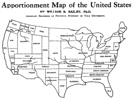
Prof. John Krygier displays a true value-by-area cartogram older than any I’d seen prior. As I note in a comment on Krygier’s blog, many trace the earliest value-by-area cartogram to either Emile Levasseur’s economics textbooks (1868-75) or the Reichstag election maps of Hans Wiechel and Hermann Haack (1903). Neither of these, though, have I seen reprinted in the literature (I’m doing my thesis on cartograms — perhaps more on that soon). The earliest I’d seen, then, was from William Grundy and was published by the Washington Post in 1929 (as reprinted in this [pdf] by Waldo Tobler). The map printed by Krygier, though, precedes this by 18 years. An “apportionment map of the United States” created by William Bailey in 1911:
in this guy’s blog
Talk about outsider mapping. This guy’s text cartogram is very nice, certainly as cool (and readable) as those curvy ones that get all the press. The cartogram itself is of estimated delegate counts for the Democratic Party’s primary. The following does it little justice:
And a cutout:
The creator describes it thusly:
The cartogram is generated with a bunch of spreadsheet text functions, which I use to generate HTML. I copy and paste the HTML, clean it up a bit, and it’s a map.
I love it, and there’s no reason this approach couldn’t be generalized and automated. Perhaps I’ll add it to my upcoming cartogramTools.py script project…. More on that soon….
in kelso’s blog
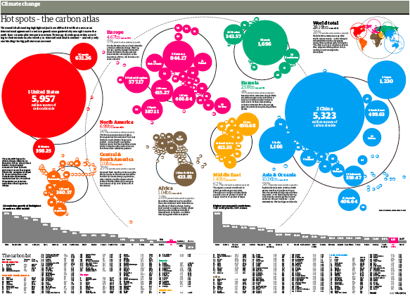
Nathaniel Vaughn Kelso highlights the “Carbon Atlas” as printed by the Guardian in December 07. The graphic (by Mark McCormick) shows states sized according to carbon dioxide emissions.
Full res pdf
Certainly one of the coolest implementations of the circular cartogram that I’ve seen. I’m not sure if you heard, but I’ve been working on a Python circular cartogram algorithm. This application certainly encourages me to see my script through to the end.
2 Comments
And Ben Coakley sent me a link to this recent cartogram-related blogpost that shows some very cool political cartograms.
Have a look at my reply here…
http://makingmaps.wordpress.com/2008/02/19/1911-cartogram-apportionment-map/